Hi!
I want to know… How to use the disclosure-state-indicator correctly? In the documentation is not clear and I want to change the default mode.
Hi!
I want to know… How to use the disclosure-state-indicator correctly? In the documentation is not clear and I want to change the default mode.
Hi @marmarquez! So you’re trying to use the Disclosure Layout in your store, but don’t like the default caret icons we use for the Show/Hide states, right?

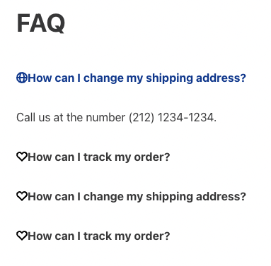
The FAQ shown in the example above uses Disclosure Layout and is seen in our demo store:
The source code for this page is available here:
Note that in line 161 we declare the disclosure-state-indicator block. As mentioned in the documentation for its props, the Show and Hide props have the type block and are used to define which blocks should be shown when content is visible or hidden.
The icon we used in our demo store come from store-icons. This app is listed as a dependency in manifest.json, allowing us to use them in our store in two different ways, according to its README:
There are two different ways to use the icons available here. If you’re developing a store’s theme, you should use the
iconblock for the icon you want to render, which behaves just like any other block and expects to receive the props exposed by its API. But if you’re developing custom components and want to use icons defined here, just follow the instructions below.
So you can change icon-caret#down → icon-heart and icon-caret#up → icon-globe, as in the code block below:
  "disclosure-state-indicator": {
    "props": {
      "Show": "icon-heart",
      "Hide": "icon-globe"
    }
  }
And get the result below instead 
Note that the styles/css/faq/vtex.disclosure-layout.css file has a specific CSS rule that adds 1 rem of margin-right to the caret icon, you should probably do something similar to achieve the best results possible with other icons.
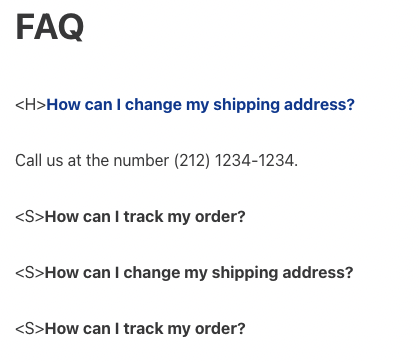
Any block is a valid option for the disclosure-state-indicator props Show/Hide!
For instance, you could use a Rich Text block like I did in the code block below:
  "disclosure-state-indicator": {
    "props": {
      "Show": "rich-text#show",
      "Hide": "rich-text#hide"
    }
  },

  "rich-text#show": {
    "props": {
      "text": "<S>"
    }
  },

  "rich-text#hide": {
    "props": {
      "text": "<H>"
    }
  }
And achieve the result below: