Mobile Submenu with submenuAccordion

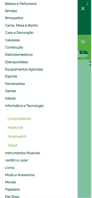
In my mobile category menu I need to add subcategories. I’m using submenu.accordion to show or hide submenus or more options when the user clicks on a title or arrow. That part is working great — the problem is with the styling. I’d like to display the submenus in columns, but I can’t get it to work even using the "orientation": "vertical" prop.

Below is the code I’m using:

“link#informatica-tecnologia”: {
“children”: [“rich-text#informatica-tecnologia”],

    "props": {
        "href": "/informatica-e-tecnologia"
    }
},

"rich-text#informatica-tecnologia": {
    "props": {
        "text": "Informática e Tecnologia"
    }
},

"menu-item#informatica-tecnologia": {
    "props": {
      "id": "menu-item-informatica-tecnologia",
      "type": "custom",
      "iconId": null,
      "highlight": true,
      "blockClass": "subcategory",
      "itemProps": {
        "categoryId": 8,
        "type": "internal",
        "href": "/informatica-tecnologia",
        "noFollow": true,
        "tagTitle": "Informática e Tecnologia",
        "text": "Informática e Tecnologia"
      }
    },
    "blocks": ["submenu.accordion#informatica-tecnologia"]
  },

  "submenu.accordion#informatica-tecnologia": {
    "children": [
      "menu-item#computadores",
      "menu-item#notebook",
      "menu-item#smartwatch",
      "menu-item#tablet"
    ],
    "props": {
        "orientation": "vertical",
        "blockClass": "list-subcategory-dropdown-column"
    }
  },

  "menu-item#computadores": {
    "props": {
      "id": "menu-item-computadores",
      "type": "custom",
      "iconId": null,
      "highlight": false,
      "blockClass": "subcategory-dropdown",
      "itemProps": {
        "categoryId": 9,
        "type": "internal",
        "href": "/computadores",
        "noFollow": true,
        "tagTitle": "Computadores",
        "text": "Computadores"
      }
    },
    "blocks": []
  },

  "menu-item#notebook": {
    "props": {
      "id": "menu-item-notebook",
      "type": "custom",
      "iconId": null,
      "highlight": false,
      "blockClass": "subcategory-dropdown",
      "itemProps": {
        "categoryId": 10,
        "type": "internal",
        "href": "/notebook",
        "noFollow": true,
        "tagTitle": "Notebook",
        "text": "Notebook"
      }
    },
    "blocks": []
  },

  "menu-item#smartwatch": {
    "props": {
      "id": "menu-item-smartwatch",
      "type": "custom",
      "iconId": null,
      "highlight": false,
      "blockClass": "subcategory-dropdown",
      "itemProps": {
        "categoryId": 11,
        "type": "internal",
        "href": "/smartwatch",
        "noFollow": true,
        "tagTitle": "Smartwatch",
        "text": "Smartwatch"
      }
    },
    "blocks": []
  },

  "menu-item#tablet": {
    "props": {
      "id": "menu-item-tablet",
      "type": "custom",
      "iconId": null,
      "highlight": false,
      "blockClass": "subcategory-dropdown",
      "itemProps": {
        "categoryId": 12,
        "type": "internal",
        "href": "/tablet",
        "noFollow": true,
        "tagTitle": "Tablet",
        "text": "Tablet"
      }
    },
    "blocks": []
  },

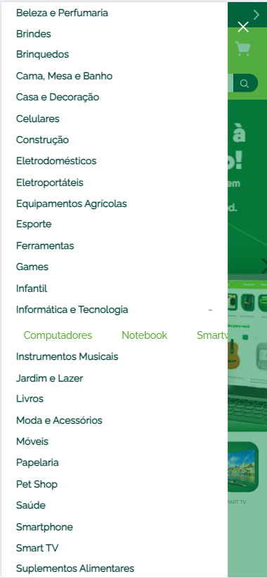
I’d like the subcategories to be displayed like this:

@Everson-Hugo how’s it going?

Did you try applying this style in the CSS file?

.list-subcategory-dropdown-column {
    display: flex;
    flex-wrap: wrap;
    gap: 10px; /* Spacing between columns */
}

.subcategory-dropdown {
    flex: 1 1 50%; /* Sets each item to take up 50% of the width */
    min-width: 150px; /* Minimum width for each item, adjustable based on the design */
}

See if it works.

If it does, mark it as the solution to help others in the community.

Cheers,
Estevão.

@estevao_santos Good, and you?

Dude, thanks a lot for the reply — yes, I already had the style and it was the same as what you sent me;

.styledLinkContent–subcategory{
color: #004439;
font-weight: 600;
font-size: 16px;
margin-bottom: 8px;
}

.styledLinkContent–subcategory-dropdown{
flex: 1 1 50%;
min-width: 150px;
color: #3fa110;
font-size: 16px;
margin-bottom: 8px;
}

.styledLinkContent–list-subcategory-dropdown {
display: flex;
flex-wrap: wrap;
gap: 10px;
padding: 10px;
width: fit-content;
}

Even so, it didn’t work. Looking at my console, I managed to get them into a column by modifying this .flex style, but I don’t know where it’s located in the project.

Hey @Everson-Hugo, no problem.

Got it.

Did you try using !important?

  1. Check CSS specificity: Make sure the selector you’re using has enough specificity to override any other styles that might be applied to the submenu. You can do this by adding more selector layers or using !important as a last resort.
  2. Change the flex style in your CSS: Make sure the container wrapping the subcategories has flex behavior with the appropriate flex-wrap and direction. You mentioned wanting subcategories in columns, so adjust the display to ensure it distributes items correctly across rows.

Try changing your CSS classes like this:

.styledLinkContent--list-subcategory-dropdown {
    display: flex;
    flex-wrap: wrap;
    gap: 10px;
    padding: 10px;
    width: 100%; /* or adjust to the desired width */
}

.styledLinkContent--subcategory-dropdown {
    flex: 1 1 45%; /* Adjust the percentage to control the number of columns */
    min-width: 150px;
    color: #3fa110;
    font-size: 16px;
    margin-bottom: 8px;
}

Make sure there are no naming errors in your styles. A common issue can be an incorrect character, such as -- vs (double hyphen or dash), which might be preventing the styles from being applied. As I noticed in the previous code, there seems to be a subtle difference.

  1. Confirm the change in DevTools: In the screenshot you sent, it looks like the .flex style is being applied directly on the page. If you managed to change the layout by inspecting in the console, try copying that specific style that worked and add it to your stylesheet, making sure it’s being loaded at the right time.

If you still can’t find where that flex style is being applied, try checking the main stylesheet or even other classes that might be applied dynamically.

Hope this helps in some way.

Cheers,
Estevão.

@estevao_santos thank you so much for the tips, I managed to fix it, I created a class for the submenu.accordion and added important in front; it ended up like this;

.styledLinkContent–subcategory{
color: #004439;
font-weight: 600;
font-size: 16px;
margin-bottom: 8px;
}

.submenuAccordion–list-subcategory-dropdown{
display: flex!important;
flex-direction: column!important;
}

.styledLinkContent–subcategory-dropdown {
color: #3fa110;
font-size: 16px;
margin-bottom: 10px;
}

.styledLinkContent–list-subcategory-dropdown {
display: flex;
flex-direction: column;
gap: 10px;
padding: 10px;
width: max-content!important;
}

@Everson-Hugo Awesome!

So glad it worked!!

So, it was probably the missing !important needed to override the style that comes directly from VTEX.

If it was the tip I gave you, mark it as the solution in the reply above so you can help others in the community.

Cheers,
Estevão.